A makeover is always a challenge, but redesigning a friend’s site is a whole different type of pressure. Welcome to this case study on the redesign of What the Pow! web, our client for this Ironhack UX/UI Design Bootcamp project.

The brief
For this Ironhack Bootcamp project, we redesigned a local shop’s website and improved its online presence to increase its visibility both online and offline. The duration? Just two weeks.
In the beginning, we had to decide on the client; we were torn between an online jewelry site, an architecture studio, and a winter clothing shop. All the potential clients were friends or acquaintances of our team.
We went for the clothing shop: WTP! or What the Pow! “Pow” meaning powder, meaning snow. It’s a clothing company from Spain that works exclusively online, and its presence is mainly through social media.
Our main goal was to analyze what already exists and improve the solution. They had a website but it wasn’t what we would call “engaging”. Let’s start the analysis.
The team
We were a group of three members: Shekoofeh Shahabi, Adrián Fernández Álvarez, and I. Adrián is not only a loyal customer of WTP! but a friend of the owner, Álvaro Aldana.

The client: WTP!
What the Pow is a company that manufactures and distributes outerwear, sportswear, and outerwear accessories. “Pow” comes from powder snow – a fun bit of wordplay Álvaro came up with when he founded the company.
They were a group of friends who decided to create a logo for their YouTube channel, where they uploaded videos about their snowy weekend trips. Álvaro started making the first sweatshirts and t-shirts to hand out to friends, and when he least expected it, it turned into a business. Some of the star products are the windbreaker, sweatshirts, fleece hoodies, and t-shirts, specially made to resist low temperatures and ski trips.
Competitive analysis
To start the process of investigation we decided to go through three stages of competitive analysis:
- Feature comparison,
- Branding comparison,
- And a market positioning map.
The competitive analysis stage started by comparing the brands that WTP! calls international and local competition. Competition at a local level would be Blue Banana; at a more international level, there’s Patagonia, The North Face, Decathlon, etc.
 Alex Walton
Here in the Feature Comparison chart, we can see, at a glance, what features we needed to catch up with the competition: more payment methods, a wishlist, and a better shipping process.

The brand positioning map shows us that WTP occupies a key place in the market but it is not being well exploited. It’s time to pursue new opportunities. We have to give reviews more prominence, show the product in a more interactive way, suggest other products to the customer, and generate a help channel for users.

With all this information gathered we went through the next steps: getting information about the stakeholder(s), interviewing them, and finally carrying out user interviews.
Alex Walton
Interview with the stakeholder
Álvaro Aldana is the founder and owner of WTP! He is from Spain, the home of the project. Álvaro was clear about what he wanted from the website and even offered insights from his own research.
So what did the founder want? To improve the website to make the user experience better. He also wished to retain users coming from Instagram, where WTP! is well-known and attracts a large number of followers.
Before going ahead with the user interviews we needed to identify WTP! users and Álvaro’s idea of a dream user:
“The user I have in mind will be 22–27, he or she likes open-air sports and winter – this is fundamental! This person wishes with all their might for the weekend to come at last so they can go to a cool place far from the city.”
Álvaro matches the profile of the user he describes, which is an interesting concept for defining who may be your audience. That’s the magic of research: the deeper you go, the more you discover.
User interviews
The users we interviewed were four former customers aged 20–30.
They were clamoring for a simpler, better design, a real homepage, better organization, PayPal enablement, filters, a wishlist facility, and a clearer check-out process with an order confirmation email.
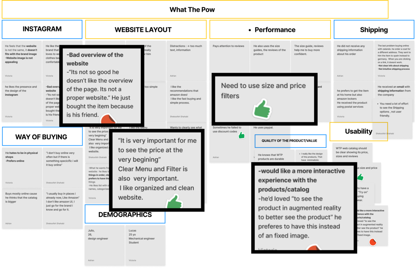
With all the data collected, we were able to draft our problem statement:
“Sporty, adventurous adults who like to do outdoor activities need to find what they are looking for and more easily and finalize their checkout process quickly. This will help them meet their goals of using their time more efficiently and having a great shopping experience.”
User persona and user journey
I present to you the amazing Armando:
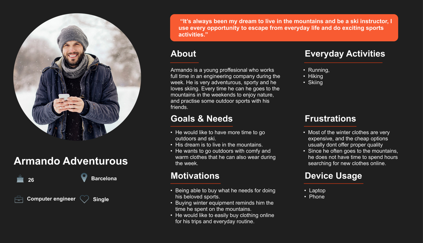
He is a very active person, but he works in an office from Monday to Friday. Armando can’t stop thinking about where he is going to go with his friends at the weekend.

He only wants to pack his stuff and run away to a mountain and ski without being disturbed by any of the obligations of his city life. So how might we help him?
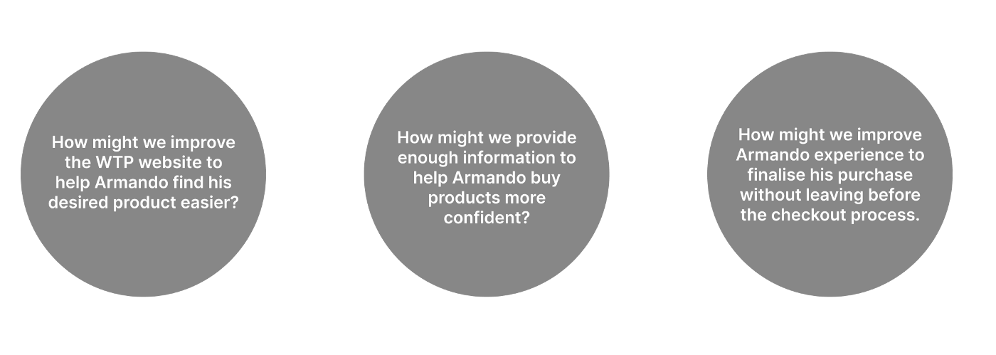
The list of answers to these questions was long, very long. Eventually, we went for the Moscow Method to prioritize some of the features of the list. Our most direct objectives are improving the design, giving consistency to the website, adding color and size filters, building a wishlist feature, and adding more payment methods.

Sitemaps: Old and new
To understand how the current web works we made a site map and redesign a possible new one.

User flow: Happy path

After creating the new sitemap, we created a happy path user flow. This shows the journey of a user who wants to buy a t-shirt, but as he starts exploring the web, he decides to add a mug he likes to his wishlist. Once he reaches the checkout, he decides to move the mug from the wishlist to his cart and buy both the mug and the t-shirt. He is very happy with this decision. Why? Because he’s on the happy path 😆.
Ideation: The fun part?
Thus far, while carrying out this research, I’d gone days without a good night’s sleep, and I’d had innumerable discussions with my colleagues, but finally, I had something to show for my efforts: the first round of concept testing sketches.

After a round of concept usability tests, we gathered some insights and went straight for the first mid-fidelity wireframe.


To understand whether or not the site was usable, we conducted usability testing that came up with interesting results:
- Back button needed
- Wishlist screen creation needed
- Checkout was easy
- Menu interactions are efficient
- Overall design was cohesive
User interface: Mood board and style tile
We created a mood board to validate the attributes we picked for the brand.

To that end, we tested our board with 24 colleagues, who told us what adjectives or words came to their minds after seeing it.
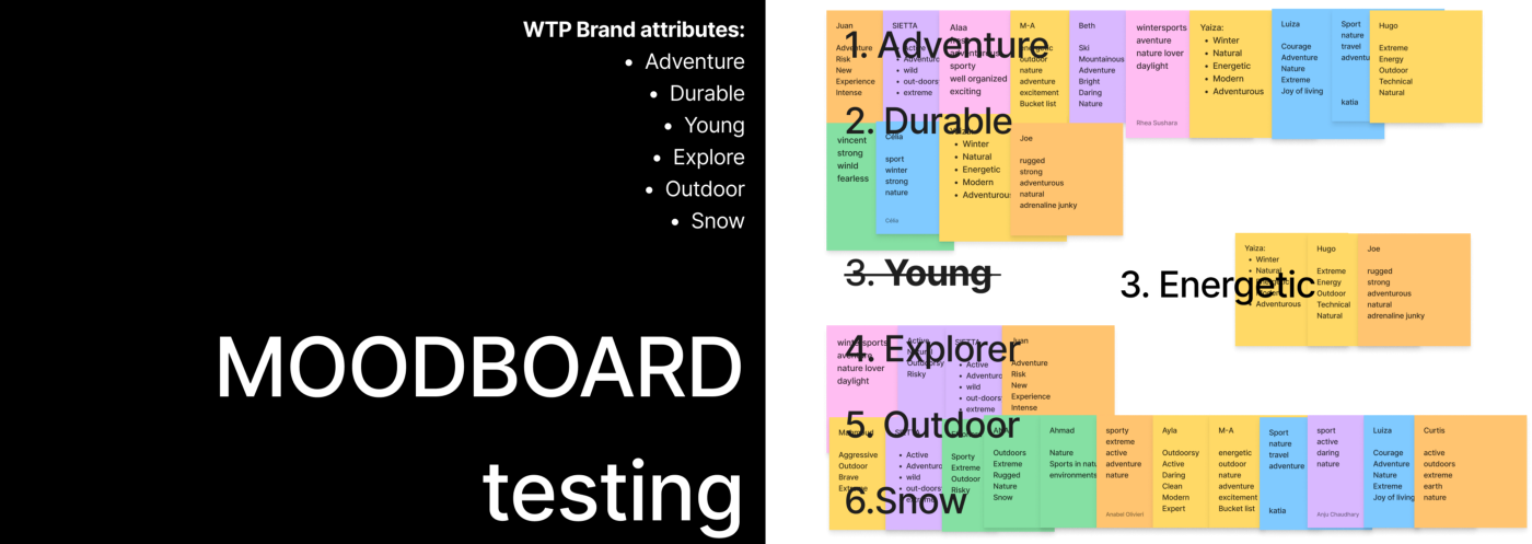
Through the images we wanted to evoke a particular style or concept, and we did it. The only mismatch was “young” being interpreted as “energetic”, so we changed it. After all “we artists owe ourselves to the public” – or is it the other way around? 🤔…Never mind. We decided to change it. “Energetic” is more inclusive than “young”.
Oh colors, I almost forgot. For the colors, we took our stakeholder insights and preserved the black and white vibe but we added green and orange accent colors. Both colors are inclusive, unisex, and don’t compromise the style of the clothing. Also, green reminds us of the love for nature and the orange gives us that piece of freshness and warmth this brand wants to transmit.
HIGH-FIDELITY, YES GURL!
Day 953: we have a high-fidelity wireframe. Without further ado, here’s how the final prototype for mobile and desktop looks.
Menu screen of WTP!
Do you like it? Would you buy clothes there? Tell me more!
Next steps
After the prototype saw the light of day, we went for another round of testing (testing never ends). We did desirability testing to validate some of the values of the new website and get feedback before presenting the site to the client. The results were positive and consistent with our goals for the site.

Takeaways
This will sound cheesy, but we started as a team and ended as a team, despite the differences, despite the lack of sleep, and despite working remotely. In the beginning, we were full of opinions and assumptions. We followed the process and slowly ended up playing different roles that were crucial to completing the project. We kept communicating and improving the whole time.
Adding the UI was fun, but we shouldn’t forget that UXD is a process. Decisions on colors and typography and the placement of objects and components have to be made as a team. A little common sense helps too.
Finally, feedback was crucial from the very beginning. We ran interviews, concept tests, usability tests, and desirability tests, and we improved with every test we did.
We let you do the talking. 📣
Consider yourself an expert in competitive intelligence or competitive enablement? Feel like this 🤐 and looking for a platform to get your voice out there?
Look no further. The Competitive Intelligence Alliance wants thought leaders like you to get in touch.
It's your insights we're after, so if you're strapped for time we'll have a quick chat, then write the article for you. 💯

.png?v=cfdf7234c2)