
If you’ve ever poured weeks into a competitive analysis only to see it skimmed – or worse, ignored – you know the frustration.
Senior stakeholders are bombarded with information, and unless your insights are clear, concise, and memorable, they risk getting lost in the noise.
That’s why creating “wow” matters. It’s not about flashy slides or clever phrasing; it’s about delivering your findings in a way that grabs attention, sparks engagement, and drives decisions.
I’ve spent years in JLL’s corporate strategy team learning what it takes to make competitive intelligence (CI) presentations land with executives who have limited time but high expectations.
In this piece, I’ll walk you through the essentials: why presentation skills are a critical part of every CI professional’s toolkit, and five practical ways to make your insights stand out and have maximum impact.
Why you need to improve your presentation skills as a CI pro
Presenting research effectively in competitive intelligence brings multiple benefits for you, your stakeholders, and your organization.
1. It helps you build new skills
Instead of simply churning through research, you start thinking about how to convey information in the best possible way. You get to find creative ways to visualize data and complex concepts, which is far more enjoyable than just processing data behind the scenes.
2. It drives greater retention and engagement from your audience
Your CEO or stakeholder will remember a well-structured presentation with clear, simple insights. They’ll be more engaged, retain more information, and your message will have a stronger, longer-lasting impact.
3. It enables faster decision-making
When your audience receives concise, well-structured insights, they can quickly absorb the information and make informed decisions that move the business forward.
4. It enhances the value and perception of the CI function
Communicating clearly and professionally shows that you understand what matters to the business. It helps position you – and CI as a discipline – as a strategic, high-value contributor. And in today’s uncertain business climate, demonstrating that value is more important than ever.
Tips and tricks for a great competitive intelligence presentation
So, what are some of the practical ways to create “wow” in your CI presentations?
Let’s start with five key principles:
- Begin with the end in mind
- Keep it simple
- Consider your audience
- Get creative with your visuals
- Focus on continuous improvement
Tip #1: Begin with the end in mind
The first principle – begin with the end in mind – is rooted in the Minto Pyramid Principle. If you’ve worked in consulting, this probably sounds familiar. It’s all about leading with the answer.
You start with a governing thought – the main insight or takeaway – right at the top of your presentation, executive summary, or deck. Then, everything else that follows supports that thought. Beneath it, you layer your supporting insights, and finally, your data and evidence that validate those insights.
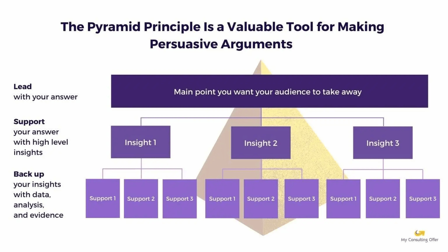
This structure keeps your story clear, logical, and persuasive. If you open with pages of raw data, you’ll lose your audience – especially busy executives. They want to know the findings first, not dig for them.
This approach also helps you frame your work strategically from the start. For example, if you’re asked to research a competitor’s technology strategy, you’ll likely have an initial hypothesis, based on what you already know. Even before all the data is in, that working hypothesis gives you a foundation to build on.
As your research progresses, you can test and refine that hypothesis. I do this almost daily – it’s far more efficient than getting lost in endless data. It’s about continuously shaping your story as you learn more, ensuring that your final presentation is structured and focused around the most relevant insight.
Tell your story like you almost got eaten by a bear
There’s a great analogy I’ve seen floating around on LinkedIn that captures this idea perfectly.
Imagine you’re telling a story about how you almost got eaten by a bear. (Stick with me!) If you start with, “So today I went hiking with my friends. We grabbed lunch, wandered around, chatted for a while… oh, and then I almost got eaten by a bear,” your audience has probably tuned out by the time the drama starts.
But if you start with, “I almost got eaten by a bear today,” you’ve instantly grabbed their attention. They’re hooked. They want to know more.
That’s exactly how you should think about structuring your CI story. Lead with the insight – the “bear” moment – and then build out the details and evidence that support it. Cut the backstory, get straight to the point, and your audience will stay engaged from start to finish.
Tip #2: Keep it simple
The second principle is all about simplicity – one message, one slide. It sounds obvious, right? But in practice, it’s surprisingly hard.
As CI professionals, we live and breathe information. We uncover data, insights, trends, and competitive moves – and naturally, we want to share it all. But the truth is, less is almost always more. The simpler and clearer your message, the greater the impact.
Each slide should focus on a single key idea. For example, if you’re showing that a competitor’s revenue has grown by a certain percentage compared to yours, stick to that point. Don’t clutter the slide with extra charts or supporting data. A focused, well-constructed slide lets your core insight stand out – ideally, the takeaway should be obvious even at a glance.
Keep your design clean and consistent
Use simple, consistent colors, shapes, and images throughout your presentation. While flashy graphics or animations can look fun, they can also distract from your message. A clean design directs attention to what matters – your insights. There’s a time and place for creativity, but in most professional contexts, simplicity wins.
Keep to time
Be respectful of your audience’s time and attention.
Take the total time you have to present and cut it in half – that’s roughly the number of slides you should use.
For instance, if you have 20 minutes to present, aim for about 10 slides.
The goal is not to rush through dozens of slides but to leave space for discussion and reflection. Fifty slides in fifteen minutes will only overwhelm your audience and bury your key points.
Managing too much content
If you’ve got more material than fits comfortably, don’t worry – there are workarounds.
Put the key messages in your main deck and move the detailed data to the appendix. You can circulate the full version afterward so your audience can dive deeper if they’d like.
Another approach is to create two versions of your deck:
- A presentation deck: Short, visual, and designed for live delivery.
- A “lap deck”: A more detailed version that your audience can read through later.
This ensures your live presentation stays focused while still giving stakeholders access to the supporting evidence they may want later.
Don’t read from your slides
Finally, remember that your slides are there to support you, not replace you. If you simply read the text word-for-word, you might as well just send the deck. Instead, use your slides to highlight and reinforce your main points visually while you bring the story to life.
Tip #3: Consider your audience
When planning your presentation – whether it’s a live session, a slide deck, or even a written memo – one of the most important things you can do is consider your audience. Understanding who you’re talking to and how they process information helps you ensure your message lands.
Know your primary stakeholders
Start by thinking about your primary stakeholders. How do they prefer to receive and process information? Are they detail-oriented and analytical, or do they prefer big-picture insights and strategic takeaways?
Tailoring your presentation style to match their preferences helps ensure that your message resonates. If they like details, make sure your data is accessible and clear. If they’re more strategic, focus on the implications and recommendations.
Anticipate what’s top of mind
Next, think about what’s happening in your industry or within your company that might be on your audience’s mind. Are there recent competitor moves, major investments, or emerging trends that could come up during the discussion?
Even if these topics aren’t directly part of your presentation, being prepared to address them will make you appear informed and credible.
Anticipating questions – even tangential ones – shows that you’re not just presenting information but actively thinking about the broader context. It also gives your message more impact because it proves that you truly understand the space you’re speaking about.
Understand presentation preferences
Different stakeholders prefer different presentation formats. Some like to receive pre-reads in advance, using meeting time for discussion rather than a formal presentation. Others may prefer a live presentation, where they can absorb the information as you talk through it.
If you’re not sure what to expect, it’s best to prepare for both. Have a detailed version of your deck ready for pre-reading, and a simpler, more visual version for live delivery. This flexibility ensures you’re ready for any scenario – whether it’s a structured presentation or an open conversation.
Be mindful of cultural and language contexts
Finally, always consider cultural and language differences, especially if you’re presenting to an international audience. If you’re speaking in English to a group whose first language isn’t English, adjust your pace, simplify your language, and use visuals to support key points.
Cultural norms can also influence how audiences expect information to be delivered – for example, how direct or data-heavy your presentation should be.
By being mindful of these nuances, you’ll not only communicate more effectively but also show respect for your audience’s preferences and perspectives. And that, in turn, will make your message far more impactful.
Tip #4: Get creative with your visuals
Now we get to the fun part – getting creative with visuals. There aren’t any strict rules here, but one thing is universal: people love visuals. A picture really is worth a thousand words.
A well-designed visual can make your insights pop without relying on lots of text. When your audience can instantly see what you’re saying, your message becomes more memorable and impactful.
Choose visuals that tell the story
Let’s look at an example. In the slide on the left, you can see a table full of useful data – detailed, accurate, and well-researched. But it’s dense. The insights are buried in text, and you’d have to talk your audience through every row to make the point clear.
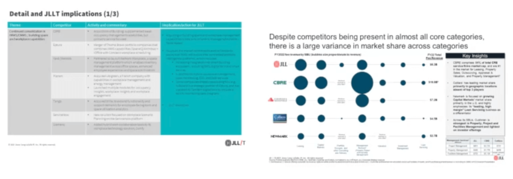
Now compare that to the slide on the right, which shows competitors’ market share across different business lines. With one glance, you can immediately grasp the story – who’s leading, who’s lagging, and where the gaps are. It’s visually engaging and easy to interpret.
(I’ll admit it – I actually created that slide on the left. The moment I saw how little reaction it got compared to the visual on the right, I learned my lesson.)
Look for inspiration everywhere
There are so many great examples of creative and effective data visualizations out there. You can find inspiration in places like Visual Capitalist, which publishes beautifully designed charts and infographics, or McKinsey Quarterly, which often features a “Week in Charts.” Publications like the Financial Times also do a fantastic job of turning complex data into clear, engaging visuals through data journalism.
Of course, that doesn’t mean every slide needs to be flashy or complex. Sometimes a simple bar chart is exactly what you need. The goal isn’t to decorate your presentation – it’s to clarify and enhance your message.
Think beyond numbers
Visual storytelling isn’t limited to quantitative data. You can also use visuals to represent qualitative or abstract concepts – things like competitive positioning, strategic direction, or customer sentiment.
People process visuals faster than text, and they remember them longer. So, whenever you can, find ways to show rather than tell. A well-chosen image or chart can capture attention, make your insight pop off the page, and make your story stick.
Tip #5: Focus on continuous improvement
Finally, let’s talk about one of the most important parts of presenting – continuous improvement.
I’ll be the first to admit, I don’t always get everything right. There are definitely times when I could do better. Sometimes it’s just a matter of avoiding the last-minute rush. We’ve all been there. The key is to keep learning, keep experimenting, and keep finding ways to improve.
Ask for feedback
After each presentation, ask for feedback – from your boss, your peers, or any stakeholders who were in the room. If they don’t offer it voluntarily, reach out and ask directly: How could I have done better? Was there anything unclear? Did the message land the way I intended?
Feedback helps you see your presentation from another perspective. Even small suggestions – like reordering slides, simplifying a chart, or spending more time on key insights – can make a big difference next time.
Reflect and adapt
Do some self-reflection after each presentation. You probably already have a sense of what worked and what didn’t. Which parts of your talk landed with the audience? Which sections felt flat or rushed?
If you present regularly to the same group, you’ll start to notice patterns in what resonates. Use that awareness to adapt your approach and tailor your communication style. That flexibility builds trust and makes you a more effective and credible partner.
Learn from others
Inspiration is everywhere. Watch how others present – whether it’s colleagues, industry peers, or even professional speakers. Conferences, webinars, and TED Talks can be great sources of ideas. Some of those techniques might not fit a corporate setting perfectly, but they can still spark creative ways to visualize or explain your message.
And don’t be afraid to borrow good ideas. If someone uses a slide format or visual style that works well, adapt it for your own use. Everyone does it. What matters is that it helps you communicate more clearly and effectively.
Always aim to grow
At the end of the day, great presentations – whether in competitive intelligence, consulting, or research – are about creating impact. They’re about delivering persuasive, actionable insights that help your stakeholders make better decisions.
Keep refining your craft, stay curious, and never stop learning. The more you practice and evolve, the more your work will resonate – and the more value you’ll bring to your organization.
This article is based on Susan Sutherland’s brilliant talk at the virtual Competitive Intelligence Summit, 2023.

.png?v=a0b3b2586c)